Adding Icons to a Network Navigator Dashboard
In Network Navigator Dashboards, you can use custom icons to represent different types (classes) of data in the knowledge graph. The steps below guide you through identifying the types in the Network View, if necessary, so that you can choose icons, uploading the icons the library, and applying the icons to specific classes.
To be able to upload and apply icons, a Network Navigator Dashboard must exist and have a Network View that displays at least one node. For instructions on creating a dashboard, see Creating a Network Navigator Dashboard (Preview).
Identifying Types and Preparing Icons
When configuring a dashboard to display icons, the icons are applied at the class (type) level. That way each property of the same type is represented by the same icon. If you are unfamiliar with the data that is displayed in a View, there are a couple of ways you can identify the classes:
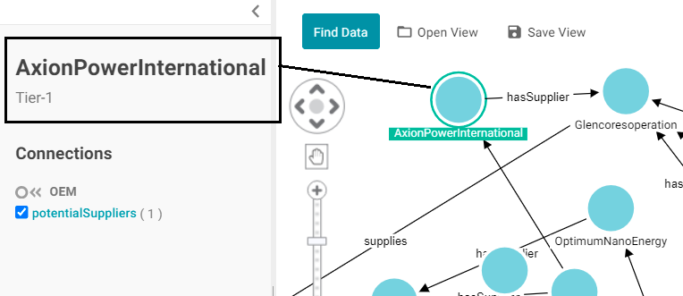
- You can select a node in the View and see the type below the node label on the left side of the screen. For example, the image below shows that the AxionPowerInternational node is in the Tier-1 class.
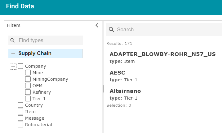
- You can click Find Data and open the Filter panel. Expand the contents to see the classes and subclasses. For example:
Once you know the types of the nodes in the View, you can determine the appropriate icon to use for each type. Download the icons to your computer, if necessary. When uploading icons to the library, you will browse your computer to select them. The application supports standard image formats like PNG, JPEG, and SVG.
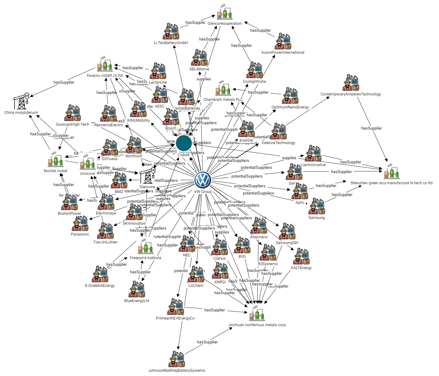
The examples from the list above show a portion of a View and a list of the classes and subclasses for an automobile supply chain knowledge graph. The entire View (shown below) shows companies that are potential suppliers of Cobalt to the VW Group. In the example, adding icons would hep users distinguish between the first tier companies, mining companies, refineries, mines, etc.
Uploading and Applying Icons to a Dashboard
Follow the instructions below to upload images to the icon library and then apply them to the classes in your Network View.
When you apply icons to the classes (types) in a dashboard, those icons will apply to all Network Views that include those types.
- Open in the Hi-Res Analytics application the Network Navigator Dashboard that you want to add icons to.
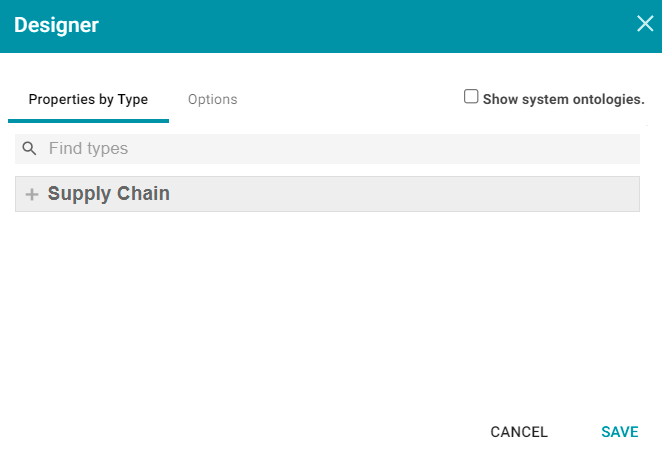
- In the main toolbar, click the Designer button. The Properties by Type tab is displayed in the Designer. For example:
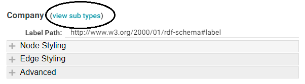
- Expand the view of the Model to display each of the types (classes). If the Model contains subclasses, you can view them by clicking the View Sub Types link next to the parent class (shown below).
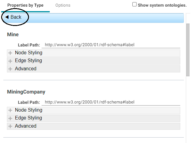
When viewing the subtypes, you can click Back to return to the parent level. For example:
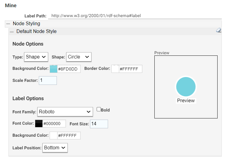
- Under the class that you want to apply an icon to, expand Node Styling. Then expand Default Node Style. For example, the image below shows the default node style configuration for the Mine type.
- Under Node Options, click the Type drop-down list and select Icon. An Icon field with a Browse button is displayed below Type:
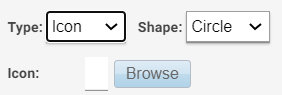
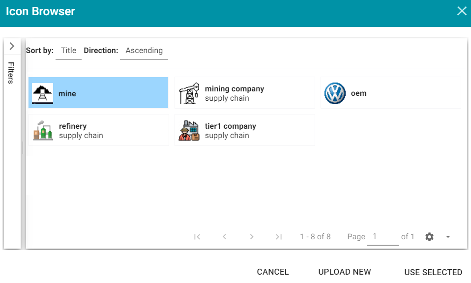
- Click Browse to open the Icon Browser. The Browser lists the icons that have been uploaded to the application and gives you the option to upload new icons. For example, the image below shows that two icons have been uploaded previously and are in the library.
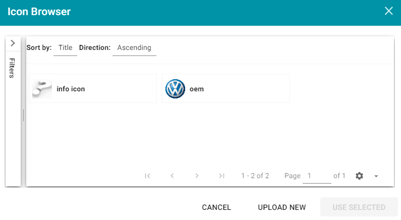
In the image, the icon that is shown as a question mark is an SVG image that does not render properly in the Icon Browser but does display in the Network View.
- To apply an existing icon, select the icon and click Use Selected. To add new icons, click Upload New. The Icon Uploader dialog box is displayed:
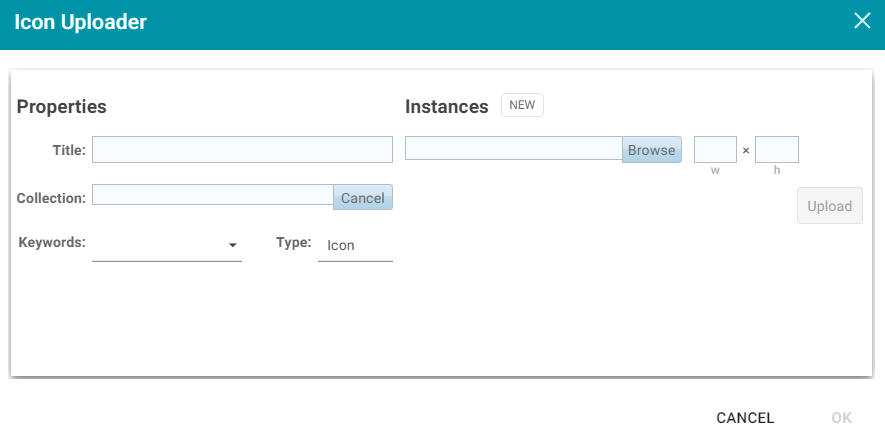
- In the Icon Uploader dialog box, complete the following fields as needed:
Title
Required field that specifies the name of the icon.
Instances
Required field that specifies the icon to upload. Only one icon can be selected at a time. Click Browse to navigate to the icon on your computer and select it. When an icon is selected, the width and height fields are populated to show the size of the selected image. You can adjust the size but it is not required. The images are automatically downsized when displayed in the View.
Collection
Optional field that specifies the collection to add the icon to. If you want to be able to filter icons by collection, you can select an existing collection from the drop-down list or click New and type a new name to add to the list.
Keywords
Optional field that specifies any keywords to tag the icon with. Keywords also enable users to filter icons.
Type
Required field that specifies the type of image you are adding to the library. Icon is the default value and should not be changed.
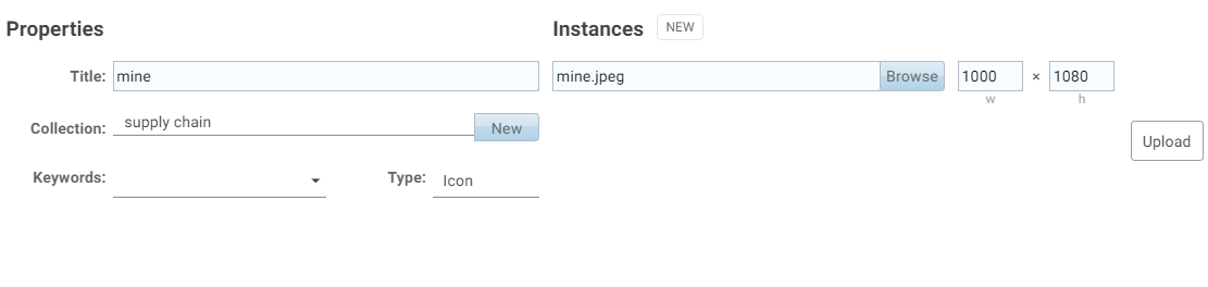
The image below shows an example of the properties set for an icon that will be used to represent the nodes for mines.
- When you have finished configuring the icon properties, click Upload to upload the icon. The dialog box shows a preview of the new icon. Click OK to close the dialog box and add the icon to the Icon Browser.
It is helpful to repeat Steps 7 – 9 until you have uploaded all of the icons that you want to use for the dashboard. That way you can more efficiently apply the icons to the types in the Designer.
- When you have finished uploading icons to the Icon Browser, the next step is to apply them to the classes. First, select the icon that you want to apply to the class you selected in Step 4. For example, in the image below, the mine icon is selected for the Mine class.
- Click Use Selected to apply the icon and return to the Designer where you can preview the icon and configure additional node options.
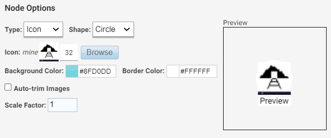
- If you want to change the shape, size, and background or border color for the icon, you can adjust the following properties:
Shape
Enables you to set the icon shape to Circle or Square.
Background Color
Controls the color of the background if the icon is transparent or is smaller than the chosen shape. You can click the colored square to use the color picker or type the hex value for the desired color in the text box.
Border Color
Controls the color of the border around the icon. You can click the colored square to use the color picker or type the hex value for the desired color in the text box.
Auto-Trim Images
This setting trims the image to fit in the chosen shape if it is larger than the shape.
Scale Factor
Enables you to scale the icon size up or down.
-
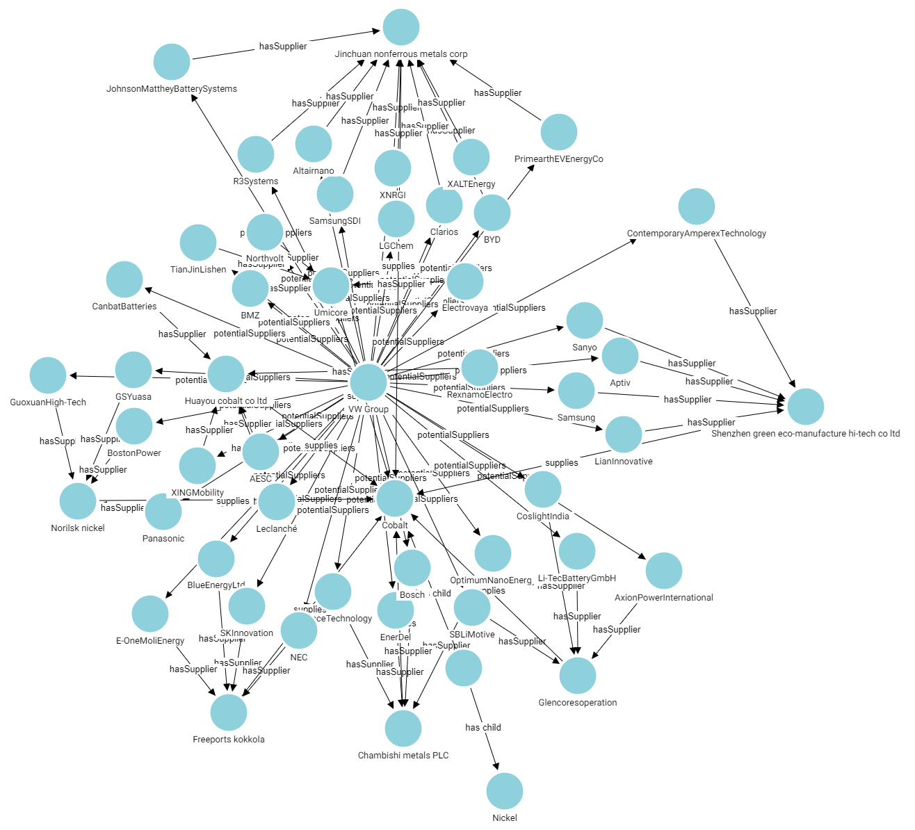
When you have finished configuring the icon for the selected class, navigate to the other classes and repeat the steps above to apply and configure additional icons. When you have finished applying icons, click Save to apply the changes and close the Designer. The new icons will be applied to the nodes in each Network View for the dashboard. For example, the image below shows the revised View of the sample automobile supply chain knowledge graph.