Create a Heat Map
A heat map depicts values of interest across two axes. The axis variables are divided into ranges like a bar chart, and each cell’s color indicates the value in the corresponding cell range. This topic provides instructions for creating a heat map with minimal configuration. Descriptions of all of the available configuration options are included below the steps.
Complete the Minimum Configuration
Follow the instructions below to create a heat map. The instructions guide you through completing the minimum configuration needed to display your data in the chart. Additional, optional configuration settings are described in Optional Configuration Settings.
- In the dashboard that you want to add a lens to, click Lenses in the main toolbar and select New. The Create Lens dialog box is displayed:
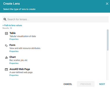
- On the Create Lens dialog box, select Chart, and then click Next. Anzo displays the General Information dialog box.
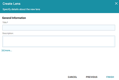
- Type a Title and optional Description for the lens.
- Click Finish. The lens Designer dialog box is displayed:
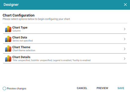
- Click Chart Type to open the Chart Types dialog box:
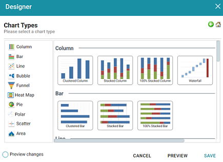
- On the left side of the screen, select Heat Map, and then select the Heat Map icon in the main part of the screen. Once the type is selected, you are returned to the Chart Configuration screen, and the Chart Type value is set to the type that you chose.
- Next, select Chart Data to add the data that will populate the chart.
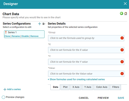
The Series Configurations section of the screen contains settings to manage each series. One series is created by default. A series is a set of data to display on the chart, for example a line on a line or area chart or one set of columns on a column or bar chart. The details for the selected series appear in Series Details, which contains settings to define the details of the selected series, such as the data to display as well as formatting and labels. From Series Configurations, you can clone, rename, disable (remove the series from the chart without deleting it), or remove a series. You can add a series by clicking the plus icon (
 ) or delete all series by clicking the trashcan icon (
 ). Removing a series cannot be undone.
 - Under Series Configurations, click Rename under Series 1 and give the series a meaningful name that describes the data that will populate the chart.
- Under Series Details, click the Group field and select the property to use for grouping the data in the series. You can use functions to derive the values for the groups. The list below describes the icons and options that are available when choosing a property:
- The Root Value (
 ) is the instance URI for the root resource—the URI for the instances of the class that was chosen as the data type for the dashboard.
 To view the root values, you can use the STR function to show a string representation of the URIs.
- Linked classes are represented by incoming (
 ) and outgoing (
 ) connection icons. The properties in those classes with a path to another class are denoted with a circle icon (
 ). Selecting a linked property navigates to that class and displays its properties.
 - When a property or path is selected, the breadcrumbs at the top of the dialog box show you the property path. You can click the clear icon (
 ) to clear the path and start again or you can click the forward (
 ) or back (
 ) arrows to go forward or backward one or more levels at a time.
 - After you have selected a property, you can apply a function or formula to that property to calculate the values that are displayed in the filter. To add a function, click the function button (fx) at the top of the drop-down list. The functions that are available depend on the data type of the selected property. To choose a more advanced function or type a formula, click Advanced. The Calculated Value dialog box opens and enables you to choose additional properties and functions. For more information, see Calculating Values in Lenses and Filters.
- The Root Value (
- Next, click the X field and select the property to use for the X axis values in the series. You can include functions to derive the values.
- Then select the property to use for the Y axis values by clicking the Y field and choosing a property. You can also include functions.
- Next, click the Value field and select the property to use for the value range in the series.
- If you want to add a group for the series, you can click Show formulas used for creating calculated series and add values for the following fields:
- Series Group: Specifies a property to use for grouping data in addition to the
Groupvalue. - Series Label: Specifies the property whose values should serve as the Series Group label. It is typically set to the same value as
Series Group. - Series Sort Direction: Specifies the sort direction for the series groups.
- Series Group: Specifies a property to use for grouping data in addition to the
- You can click Save any time to render on the dashboard the data that you have configured so far. You can add another series and repeat the steps above. You can also configure several more options for the chart by changing the optional parameters. The additional tabs and options are described below in Optional Configuration Settings.
Optional Configuration Settings
This section describes each of the tabs and additional settings that are available for customizing a heat map.
- Chart Data: Plot Tab
- Chart Data: X Axis Tab
- Chart Data: Y Axis Tab
- Chart Data: Color Axis Tab
- Chart Data: Filters Tab
- Chart Theme
- Chart Details
Chart Data: Plot Tab
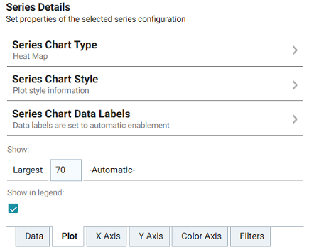
This tab contains settings that control series formatting, such as data labels, legends, and other display options.
| Field | Description |
|---|---|
| Series Chart Type |
This option opens the Chart Types selection screen where you can select a different chart type for the selected series. The selection must be compatible with the types selected for any other series in the chart, however, or the incompatible series will fail validation and not be displayed on the chart until it is corrected.
|
| Series Chart Style | This option contains the plot style settings that control the color of the ranges. |
| Series Chart Data Labels | This option contains the data label settings, which control the font, alignment, and font effects of the labels for the series. |
| Show | This setting can be used to limit the data included in the series. The limit is defined based on the largest or smallest X axis, Y axis, or Value values. |
| Show in legend | This setting controls whether to show the name of the series in the legend. |
Chart Data: X Axis Tab
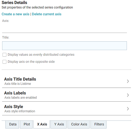
This tab defines the formats and labels for the X axis values in the series.
| Field | Description |
|---|---|
| Axis | The Axis and Title settings are populated with the X axis value from the Data tab. If multiple axes exist, you can selected a different value to use for the X axis. |
| Title | This setting defines the title for the X axis. |
| Display values as evenly distributed categories | This setting controls whether to evenly distribute X axis values. |
| Display axis on the opposite side | This setting can be enabled to move the X axis to the opposite side of the chart. |
| Axis Title Details | This option contains the X axis title settings, which control the font, alignment, and font effects of the axis title. |
| Axis Labels | This option accesses the X axis label settings, which control the font, alignment, and font effects of the labels for the axis. |
| Axis Style | This option contains the X axis style settings. These settings control the minimum and maximum values for the axis and the style and position of the grid lines and tick marks. |
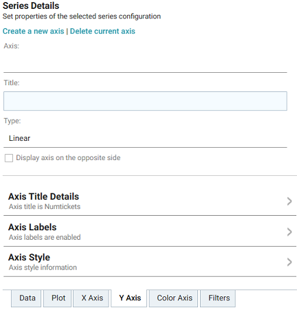
Chart Data: Y Axis Tab
This tab defines the formats and labels for the Y axis values in the series.
| Field | Description |
|---|---|
| Axis | The Axis and Title settings are populated with the Y axis value from the Data tab. If multiple axes exist, you can selected a different value to use for the Y axis. |
| Title | This setting defines the title for the Y axis. |
| Type | This setting controls the scale for the Y axis, linear or logarithmic. |
| Display axis on the opposite side | This setting can be enabled to move the Y axis to the opposite side of the chart. |
| Axis Title Details | This option contains the Y axis title settings, which control the font, alignment, and font effects of the axis title. |
| Axis Labels | This option accesses the Y axis label settings, which control the font, alignment, and font effects of the labels for the axis. |
| Axis Style | This option contains the Y axis style settings. These settings control the minimum and maximum values for the axis and the style and position of the grid lines and tick marks. |
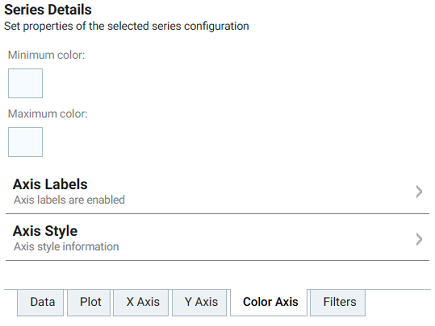
Chart Data: Color Axis Tab
This tab defines the value range block colors and axis labels and styles.
| Field | Description |
|---|---|
| Minimum color | This option defines the color for the minimum range of values. |
| Maximum color | This option defines the color for the maximum range of values. |
| Axis Labels | This option accesses the color axis label settings, which control the font, alignment, and font effects of the labels for the axis. |
| Axis Style | This option contains the color axis style settings. These settings control the minimum and maximum values for the axis and the style and position of the grid lines and tick marks. |
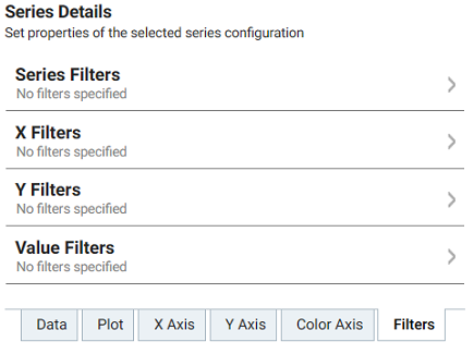
Chart Data: Filters Tab
This tab defines any filters to apply to the series.
| Field | Description |
|---|---|
| Series Filters | This option can be used to define filters that apply to the entire series. |
| X Filters | This option can be used to define filters that apply only to the X axis values for the series. |
| Y Filters | This option can be used to define filters that apply only to the Y axis values for the series. |
| Value Filters | This option can be used to define filters that apply only to the Value values for the series. |
Chart Theme
This setting presents options for configuring the theme or color scheme for the chart.
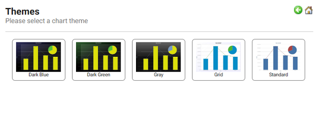
Chart Details
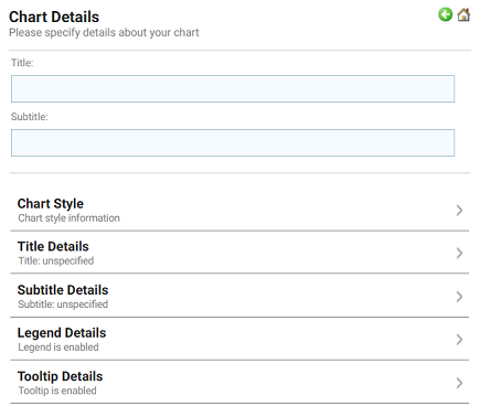
This option offers finer-grained customization settings than the Chart Theme. You can further customize the chart design by adding details such as a chart title and subtitle. You can also modify chart-level styles and fonts as well as legend and tooltip formats.
