Column Chart
There are three types of column charts:
| Example | Type | Description |
|---|---|---|
|
|
Clustered Column | A basic column chart that compares values across categories. |
|
|
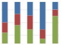
Stacked Column | Compares the contribution of each value to a total across categories. Add a Series Group to define the groups within the totals. Hover the mouse pointer over a colored area to view the value. |
|
100% Stacked Column | Compares each value as a percentage of the total. Add a Series Group to define the groups within the total. |
Column Chart Configuration
The Column Chart Designer uses the General Chart Configuration options.