Heat Map
Heat maps display data in tabular format within defined value ranges, such as low, medium, or high. Data points are rendered as a block of color depending on where they fall in the range.
![]()
Heat Map Chart Configuration
In addition to the General Chart Configuration options, the Heat Map Chart Designer includes the following heat-map-chart-specific settings on the Data tab:
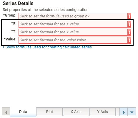
- X: Selects the X axis values.
- Y: Selects the Y axis values.
- Value: Selects the property to use for the value range.
The Heat Map Designer also includes a Color Axis tab that enables you to customize the value range block colors and axis labels and styles.
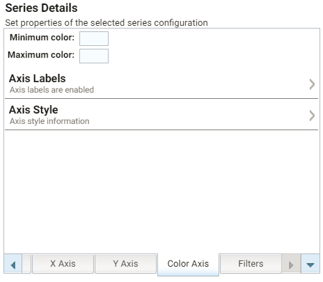
- Minimum color: The color to use for values in the minimum range.
- Maximum color: The color to use for values in the maximum range.
- Axis Labels: Enables you to customize the styles of the labels on the X and Y axes.
- Axis Style: Enables you to customize axis styles such as grid and tick lines.