Chart Lenses
Anzo Hi-Res Analytics employs the Highcharts API to provide interactive chart lenses. This section provides information about chart concepts and describes the general, shared chart settings.
Chart Concepts
This section describes the high-level, basic chart options that you can configure.
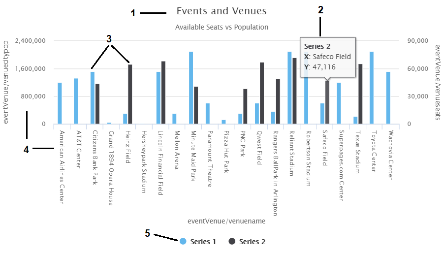
- Title and Subtitle: You can configure titles and subtitles for all charts.
- Tooltips: Configurable tooltips display details when users place their cursor over an item in the chart.
- Series: A series is a set of properties and formulas used to display data on the chart. You can include multiple data series and configure each series individually.
- Axes: The X and Y axes define the horizontal and vertical coordinates for displaying the data.
- Legend: The legend differentiates each series in the chart. You can also click a series in the legend to show or hide that series in the chart.
General Chart Configuration
When creating a chart, select the chart type that best suits your intended data presentation. All charts allow you to add multiple data series and configure each series individually.
The Chart Configuration screen is the initial screen in the Designer window that appears after you name and create the chart lens.
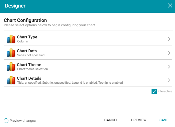
Click an option to configure the chart:
- Chart Type: Enables you to select the type of chart that you want to display, such as column, pie, or line.
- Chart Data: Enables you to specify the data that will populate the chart.
- Chart Theme: Enables you to select a theme or color scheme for the chart.
- Chart Details: Enables finer-grained customization than the Chart Theme settings. You can further customize the chart design by adding details such as a chart title and subtitle and modifying styles, fonts, legend, and tooltip formats.
Chart Designer Interface Functions
| Icon | Description |
|---|---|
|
Click the eraser icon to erase all series. This action cannot be undone. |
|
Click the back icon to return to the previous screen. |
|
Click the home icon to return to the Chart Configuration screen. |
 |
Click the plus icon to add a series. |
Chart Data
The Chart Data screen allows you to configure the Properties and formulas that populate your chart. Most charts share the same settings.
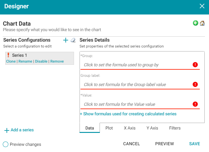
Series Configurations
The Series Configurations section contains settings to manage the data series. Click a series to select it. The Series Details appear in the section to the right. The Series Configuration options are:
- Clone: Creates a new series with the same settings.
- Rename: Renames the series.
- Disable: Removes series data from the chart without deleting it.
- Remove: Deletes the series. You must have at least one active series for a functioning chart. Removing a series cannot be undone.
Series Details
Depending on the chart type, five tabs appear at the bottom of the Series Details screen:
- Data: Defines properties and formulas used to populate the chart.
- Plot: Defines chart formatting, including data labels, legends, and other display options.
- X Axis: Defines formats and labels for the X axis values.
- Y Axis: Defines formats and labels for the Y axis values.
- Filters: Defines any filters to apply to this lens.
Data
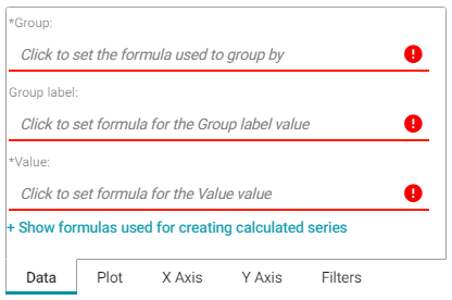
| Field | Description |
|---|---|
| Group | Defines property and optional formulas for grouping data. |
| Group label | Typically the same as Group. Defines the properties and formulas to serve as the group label. |
| Value | Defines the property and optional forrmulas to populate the values in the chart. |
| Show formulas used for... | Creates a calculated series using the following fields:
Series Group: Selects property and functions or formulas used to group data in addition to the Group setting. Series Label: Typically the same as Series Group. The property to use as the series label. |
Plot
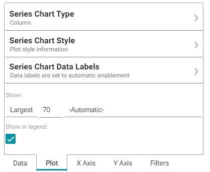
| Field | Description |
|---|---|
| Series Chart Type | Enables you to select a chart type for the series. |
| Series Chart Style | Enables you to change chart formats such as fill colors and border lines. |
| Series Chart Data Labels | Enables you to change chart data label formats. |
| Show | Enables you to define a portion of the data to display based on the largest or smallest Group Labels or Values. |
| Show in legend | Indicates whether to show the series' name in the legend. |
X Axis
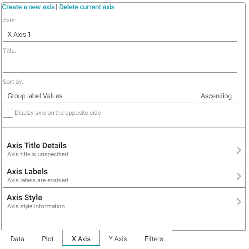
| Field | Description |
|---|---|
| Axis | Enables you to select the X axis to use for the series if multiple axes exist. |
| Title | Defines the title for the X axis. |
| Sort by | Enables you to select the sort value (either Group label or Value) for string data types. |
| Display axis on the opposite side | Moves the X axis to the opposite side of the chart. |
| Axis Title Details | Enables you to change the format for the axis title. |
| Axis Labels | Enables you to change the format for axis labels. |
| Axis Style | Enables you to make axis style changes. |
Y Axis
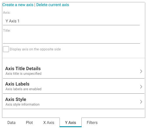
| Field | Description |
|---|---|
| Axis | Enables you to select the Y axis to use for the series if multiple axes exist. |
| Title | Defines the title for the Y axis. |
| Display axis on the opposite side | Moves the Y axis to the opposite side of the chart. |
| Axis Title Details | Enables you to change the format for the axis title. |
| Axis Labels | Enables you to change the format for axis labels. |
| Axis Style | Enables you to make axis style changes. |
Filters
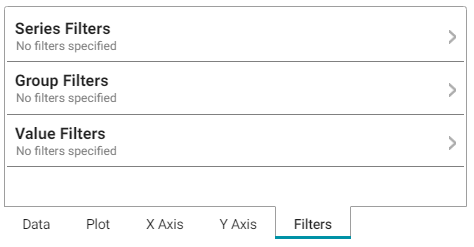
| Field | Description |
|---|---|
| Series Filters | Enables you to define filters that apply to the entire series. |
| Group Filters | Enables you to define filters that apply only to the Group values. |
| Value Filters | Enables you to define filters that apply only to the Value values. |
For more information about Series Details settings, see the documentation for specific lens types:
Area Chart
Area charts are useful for emphasizing trends. Area charts are similar to line charts but have the added ability to display stacked data series.
There are five types of area charts:
| Example | Type | Description |
|---|---|---|
|
Area | Connects value points on the chart with straight lines and shades the area below the line. |
|
Step Area | Connects value points on the chart with short horizontal steps and shades below the line. This chart emphasizes the extent of value change by expanding the data points across the x axis. |
|
Area Spline | Connects value points on the chart with curved lines and shades the area below the line. |
|
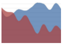
Stacked Area | Connects value points on the chart with straight lines and shades the area below the line. Add a Series Group to define the groups within the totals. Hover the mouse pointer over a colored area to view the value. |
|
100% Stacked Area | Compares each value as a percentage of the total and shades the area below each series. Add a Series Group to define the groups presented as a percentage within the total. |
In addition to the General Chart Configuration options, the Area Chart Designer includes the following area-chart-specific settings on the Plot tab:
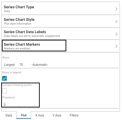
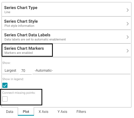
- Series Chart Markers: The options in this category enable you to customize the data points that appear on the series line:
- Enabled: Enables or disables series chart markers.
- Symbol: Selects a symbol to mark data points.
- Marker Radius: Defines the marker size in pixels.
- Fill Color: Defines the marker color.
- Outline Thickness: Defines the thickness of the marker outline.
- Outline Color: Defines the color of the marker outline.
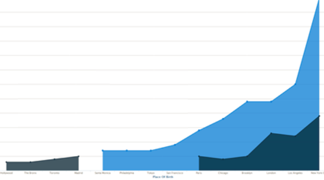
- Connect missing points: Selecting this option connects the graph line across missing points.
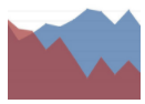
For example, selecting Connect missing points for the example below would connect the two dark blue areas by filling in the space between them.
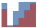
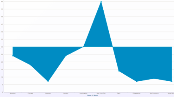
- Threshold: Defines the Y axis value to use as a base (starting point) for the shaded area. For example, a Threshold of 0 begins all shading at the value 0. A Threshold of 10 begins the shading at 10 and draws the area chart above or below the threshold as required. For example, the image below shows an area chart with a threshold of 30.
Bar Chart
There are three types of bar charts:
| Example | Type | Description |
|---|---|---|
|
Clustered Bar | Compares values across categories. |
|
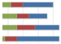
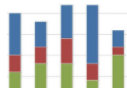
Stacked Bar | Compares the contribution of each value to a total across categories. Add a Series Group to define the groups within the totals. Hover the mouse pointer over a colored area to view the value. |
|
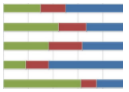
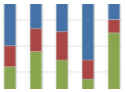
100% Stacked Bar | Compares each value as a percentage of the total. Add a Series Group to define the groups within the total. |
The Bar Chart Designer uses the General Chart Configuration options.
Bubble Chart
Bubble charts are useful for displaying data that has a third dimension. Bubble charts plot points for the X axis, Y axis, and represent relative size.
In addition to the General Chart Configuration options, the Bubble Chart Designer includes the following bubble-chart-specific settings on the Data tab:
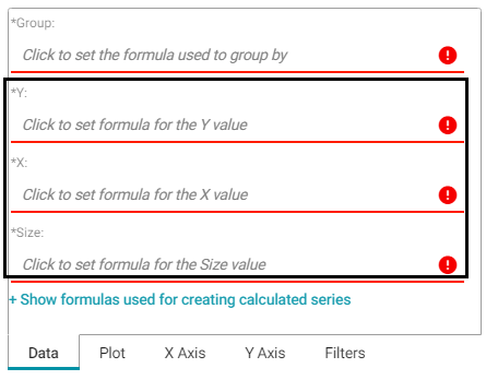
- Y: Selects the Y axis values.
- X: Selects the X axis values.
- Size: Selects the property to use to determine the proportionate bubble size.
The Bubble Chart Designer also includes the following bubble-chart-specific settings on the Plot tab:
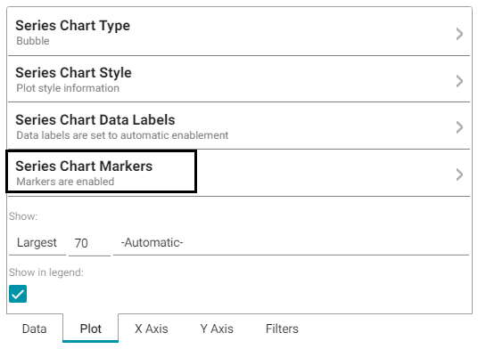
Series Chart Markers: The options in this category enable you to customize the data points, such as outlines, that appear on the bubbles:
- Enabled: Enables or disables series chart markers.
- Symbol: Selects a symbol to mark data points.
- Marker Radius: Defines the marker size in pixels.
- Fill Color: Defines the marker color.
- Outline Thickness: Defines the thickness of the marker outline.
- Outline Color: Defines the color of the marker outline.
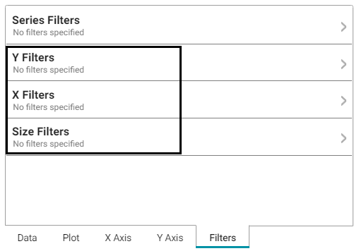
The Bubble Chart Designer enables you to create filters for the X, Y, and Z (Size) axes from the Filters tab.
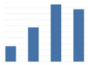
Column Chart
There are three types of column charts:
| Example | Type | Description |
|---|---|---|
|
Clustered Column | A basic column chart that compares values across categories. |
|
Stacked Column | Compares the contribution of each value to a total across categories. Add a Series Group to define the groups within the totals. Hover the mouse pointer over a colored area to view the value. |
|
100% Stacked Column | Compares each value as a percentage of the total. Add a Series Group to define the groups within the total. |
The Column Chart Designer uses the General Chart Configuration options.
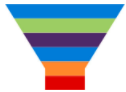
Funnel Chart
Funnel charts display a wide area at the top, with other data area proportionally smaller below it.
The Funnel Chart Designer uses the General Chart Configuration options.
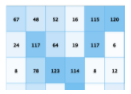
Heat Map
Heat maps display data in tabular format within defined value ranges, such as low, medium, or high. Data points are rendered as a block of color depending on where they fall in the range.
In addition to the General Chart Configuration options, the Heat Map Chart Designer includes the following heat-map-chart-specific settings on the Data tab:
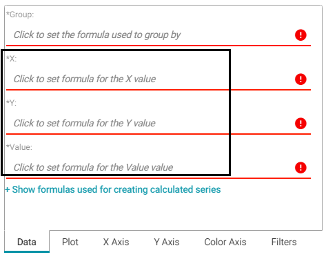
- X: Selects the X axis values.
- Y: Selects the Y axis values.
- Value: Selects the property to use for the value range.
The Heat Map Designer also includes a Color Axis tab that enables you to customize the value range block colors and axis labels and styles.
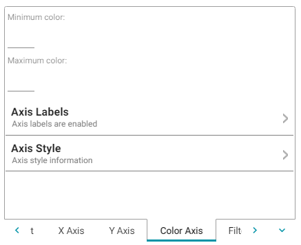
- Minimum color: The color to use for values in the minimum range.
- Maximum color: The color to use for values in the maximum range.
- Axis Labels: Enables you to customize the styles of the labels on the X and Y axes.
- Axis Style: Enables you to customize axis styles such as grid and tick lines.
Line Chart
There are three types of line charts:
| Example | Type | Description |
|---|---|---|
|
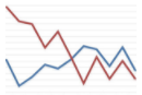
Line | Connects value points with straight lines. |
|
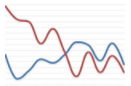
Spline | Connects value points with curved lines. |
|
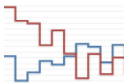
Step Line | Connects value points with short horizontal steps. This chart emphasizes the extent of value change by expanding the data points across the X axis. |
In addition to the General Chart Configuration options, the Line Chart Designer includes the following line-chart-specific settings on the Plot tab:
Series Chart Markers: The options in this category enable you to customize the data points on the lines:
- Enabled: Enables or disables series chart markers.
- Symbol: Selects a symbol to mark data points.
- Marker Radius: Defines the marker size in pixels.
- Fill Color: Defines the marker color.
- Outline Thickness: Defines the thickness of the marker outline.
- Outline Color: Defines the color of the marker outline.
Connect Missing Points: Selecting this option connects the lines across missing points.