Building a Knowledge Graph from a CSV File
This tutorial helps get you started with Anzo by teaching you the basic steps to follow when onboarding data using the automated direct data load workflow. The instructions below provide a sample CSV file and guide you through the steps required from creating the data source to visualizing the data in a Hi-Res Analytics dashboard.
- Prepare the Environment
- Download the Sample Data
- Add a CSV Data Source for the Sample Data
- Create a Graphmart from the Data Source
- Explore the Data in a Hi-Res Analytics Dashboard
Prepare the Environment
This tutorial requires a connection to AnzoGraph. Before starting the procedure, ensure that Anzo has a connection to a static AnzoGraph instance or is configured for dynamic Kubernetes-based AnzoGraph deployments. For instructions on configuring the connection to a static instance, see Connecting to AnzoGraph. For information about Kubernetes deployments, see Kubernetes Requirements.
Download the Sample Data
This tutorial uses a small sample data set from Kaggle. The data is in CSV format and includes information about the top 200 movies according to IMDB members. Click the link below to download Top_200_Movies.zip to your computer. Then extract the ZIP file to make Top_200_Movies.csv available for importing.
Add a CSV Data Source for the Sample Data
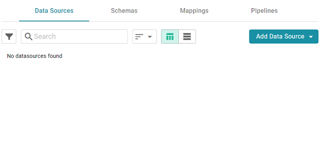
- In the Anzo application, expand the Onboard menu and click Structured Data. Anzo displays the Data Sources screen, which lists any existing data sources:
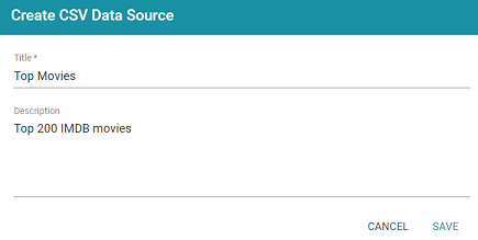
- Click the Add Data Source button and select File Data Source > CSV Data Source. Anzo opens the Create CSV Data Source screen.

- Type a name for the source in the Title field. For example, "Top Movies." Then type an optional description in the Description field. For example:
- Click Save. Anzo saves the source and displays the Tables tab for the new Data Source.
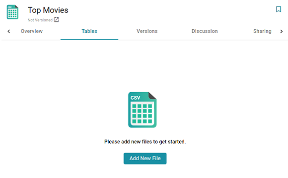
- Click the Add New File button. Anzo displays the Add New File dialog box, and the Source is set to From Your Computer.
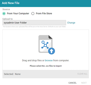
- As a best practice, check the upload location that is listed in the Upload To field by hovering your pointer over the value to view the tooltip. Make sure the upload location is a directory on the shared File Store and not a location in the server installation path. If the file is not uploaded to the shared File Store it is not accessible by applications like AnzoGraph. In addition, other users cannot publish pipelines for the Data Source because they typically do not have access to the file.
For example, viewing the Upload To location for the screen above shows that the file will be uploaded to the server installation path,
/opt/Anzo/Server/data...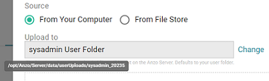
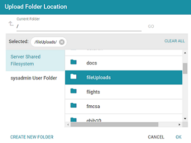
If your Upload To location is configured to upload the file to the server installation path, it is important to click Change and select another upload location that is on the shared File Store. For example, the image below shows the Upload Folder Location dialog box that is presented after clicking Change. A folder called fileUploads is selected on the File Store.
An administrator can configure the base upload path so that it points to a location on the File Store by default. For more information, see Setting the Default File Upload Path.
- Next, drag and drop the Top_200_Movies.csv file onto the screen or click browse and navigate to the file and double-click it to select it. Anzo attaches the file and the Next button becomes active. Click Next. Anzo lists the file on the left side of the screen with a status of Pending. For example:
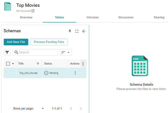
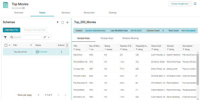
- Click the Process Pending Files button to import the data to Anzo. Anzo imports the data and the status changes to Processed. Additional buttons are also displayed on the right side of the screen. You can click the table row for Top_200_Movies to display the schema details.
Now that the data source has been added, proceed to the next step to create a Graphmart and load the data to AnzoGraph.
Create a Graphmart from the Data Source
- From the Tables screen (from the last step of the procedure above), click the Create Graphmart button at the top of the screen. The Create Graphmart dialog box is displayed:
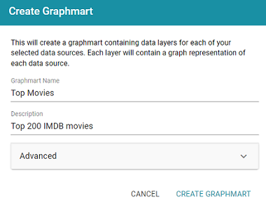
- On the Create Graphmart dialog box, the Graphmart Name is populated with the name of the data source, and the Description is populated with the description from the data source. You can edit either field if necessary. No further configuration is required. For details about the Advanced options that are on this screen, refer to Direct Load Advanced Settings Reference.
- Click Create Graphmart. The new Graphmart is created and activated.
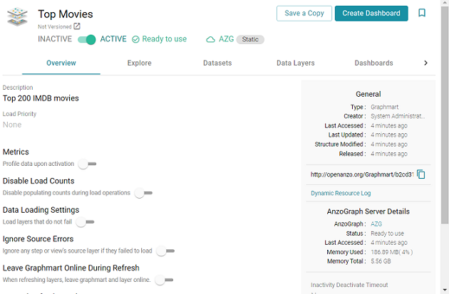
When the activation is complete, you can click the Data Layers tab to review the layer and step that were created. In addition to the layer and step, a Managed Model was also created. Now that the data is loaded into AnzoGraph, it is available to explore and analyze in dashboards. Proceed to the next step to explore the sample data in the Hi-Res Analytics application.
Explore the Data in a Hi-Res Analytics Dashboard
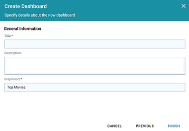
- On the Graphmart screen (as shown in the last step above), click the Create Dashboard button. Anzo opens the Hi-Res Analytics application and displays the Create Dashboard dialog box.
- Select Graphmart Dashboard and click Next. The Create Dashboard dialog box is displayed:
- On the Create Dashboard screen, specify a Title for the dashboard and add an optional Description. Leave the default Graphmart dashboard value in the Type field. For example:
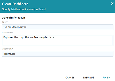
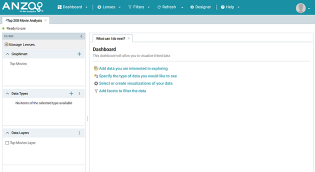
- Click Finish to create the dashboard. The new Dashboard appears as a new tab on the screen and contains a sub-tab titled What can I do next?. This tab acts as a wizard to guide you through the initial Dashboard creation. Anzo populates the Graphmart and Data Layers panels with the sample movie data graphmart name and default layer for the graphmart.
- To define the type of data to display on the dashboard, click the Specify the type of data you would like to see link on the What can I do next tab. The Select Data Types dialog box appears and displays the available data types. Since the sample data set has one type or class of data, only Top 200 Movies is listed. The value in parentheses shows the total number of instances of that type.
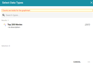
- Click Top 200 Movies to select it, and then click OK to add the data type to the dashboard. The selected type is added to the Data Types panel.
- In the main Hi-Res Analytics toolbar, click the Dashboard button and select Save to save the Dashboard.
To start to explore the data and see what values exist for the properties in the Top_200_Movies class, it can help to add a filter to the dashboard. Filters reveal the values associated with properties. Learning more about the values enables you to start making decisions about what properties to group on, for example, what properties have relationships, and what results you want to visualize.
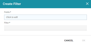
- To create a filter, click the Add facets to filter the data link on the What can I do next tab. Anzo displays the Create Filter dialog box:
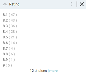
- In the Create Filter dialog box, click the Fields field and browse the available properties. For this tutorial, select Rating, and then click Close to close the Fields drop-down list. Additional options are displayed:
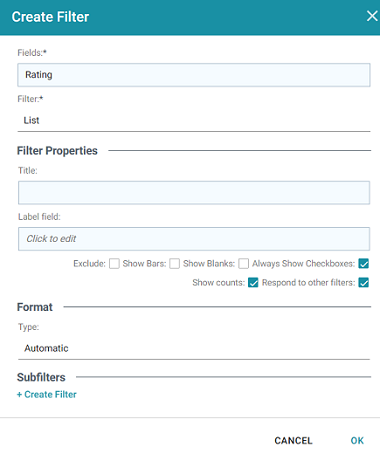
- Click the Filter drop-down list and browse the available filter types. For this tutorial, select Single Select List.
- Click OK to close the dialog box and add the new filter to the dashboard. Anzo adds the Rating filter to the left panel. The new filter will enable you to narrow the scope of the data when it is visualized.
Once you have a good understanding of the values and relationships that exist in the data set, you can experiment with lenses and decide on the most appropriate way to display the data. Creating a Table lens is a quick way to get started with learning about the values and relationships in the data and to see how the new filter works.
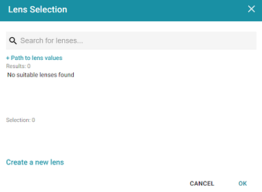
- To create a Table lens, click the Select or create visualizations of your data link on the What can I do next tab. Anzo displays the Lens Selection dialog box. Since lenses have not been created previously, the list of lenses is empty:
- Click the Create a new lens link at the bottom of the screen. Anzo displays the Create Lens dialog box:
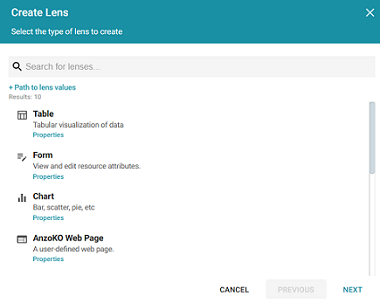
- Select the Table lens and then click Next. Anzo displays the Create Lens dialog box:
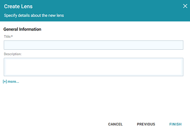
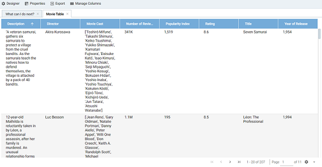
- Type a Title for the lens, for example "Movie Table," and then click Finish. Anzo adds the lens as a new sub-tab on the dashboard and opens the Table Designer:
- In the Designer, click the Auto-generate columns icon (
 ) to add all available columns to the table.
 Since the sample data set includes only 8 columns, it is not overwhelming to view all columns at once. For larger data sets, you might want to be more selective when adding columns to table lenses.
- Click Save. The table lens is added to the dashboard and is populated with data. For example:
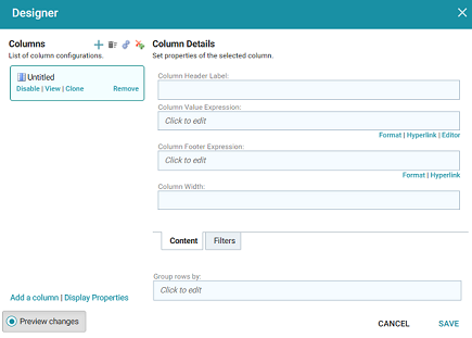
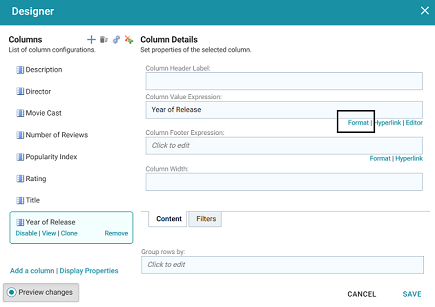
- If you want to make adjustments to the table, such as to reformat the Year of Release column to remove the commas from the values, click the Designer button for the lens. In the Designer, select the Year of Release column, and then click Format under Column Value Expression in the Column Details:
In the Format Column dialog box, click the Type drop-down list and select Year or No format, and then click Close. Click Save to change the lens change and close the Designer.
- Now, you can filter the data and reduce the number of results that are displayed by clicking a value in the Rating filter. In the filter, click any one of the ratings in the list to display only the data about movies with that rating. You can click another rating to filter the table again, and so on.
- In the Hi-Res Analytics main toolbar, click the Dashboard button and select Save to save the changes. Remember to save dashboards periodically.
Now that you can view a summary of the data in a table, it can help you determine how to further narrow or expand the results by adding, changing, or removing filters. In addition, you can experiment by adding other lenses to the dashboard to find the ideal way to display the data to answer the questions that you have. For example, the table includes a Popularity Index column. It might be interesting to see which movies were the most popular and how the popularity compares to the chosen rating in the filter. The next steps guide you through creating a chart lens to display movie popularity.
- In the Hi-Res Analytics main toolbar, click Lenses and select New. The Create Lens dialog box opens.
- Select Chart and click Next. Anzo displays the Create Lens dialog box.
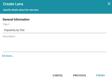
- Specify a Title and add an optional Description for the new lens. For example:
- Click Finish. Anzo displays the Chart Designer, which enables you to configure the type of chart to create, such as column, pie, or line, specify the data that will populate the chart, and customize details such as the chart's theme and fonts, legend, title, and tooltip formats.
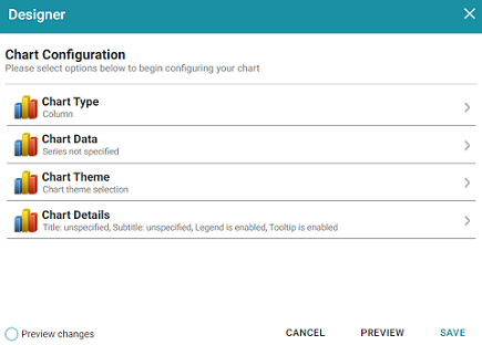
- For this tutorial, accept the default Chart Type of Column, and click Chart Data to view the Chart Data screen and configure the data to display.
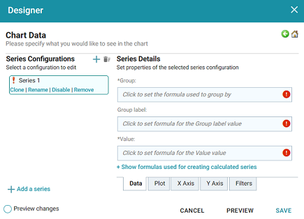
- On the left side of the screen, click Rename under Series 1. Specify a new name in the Rename Series field, for example, "Popularity Index," and then click OK.
- On the right side of the screen, click the Group field and select the Title property from the drop-down list. The Group field sets the values for the X Axis on the column chart. Then click Close to close the drop-down list. Anzo also populates the Group label with the Title property.
- Click the Value field and select the Popularity Index property from the drop-down list. The Value field sets the Y Axis values. Click Close to close the drop-down list.
- Click Save. Anzo adds the new Chart lens to the dashboard. To narrow the results that are displayed and filter on one rating at a time, click a rating in the filter. For example, by clicking 9 in the filter, the chart lists the popularity index for the titles that earned the highest rating. Of the highest rated movies, "12 Angry Men" had the highest popularity index:
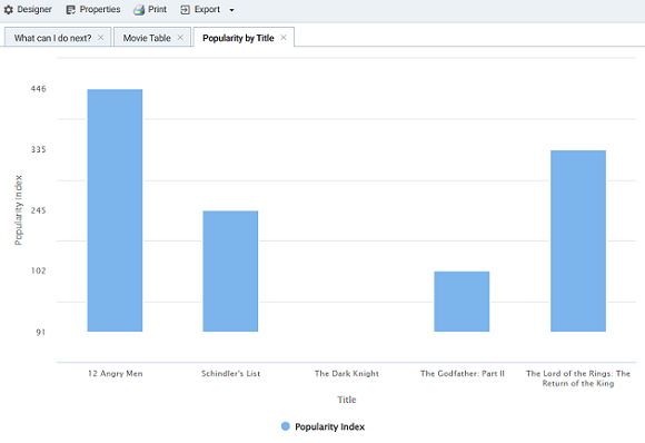
You can hover the pointer over a bar in the chart to view details.
- If you want to add more data to the Chart, such as to compare Popularity versus Reviews for each Title, follow these steps:
- Open the Chart Designer by clicking the Designer button above the lens tabs.
- In the Designer, click Chart Data.
- On the Chart Data screen, click the Add a series link at the bottom of the screen. A new series, named Series 2, is added to the list.
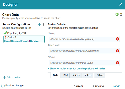
- Under Series 2, click Rename and specify a name for the series, such as "Reviews by Title." Then click the Group field on the right side of the screen and select the Title property from the drop-down list. Click Close to close the list.
- Click the Value field and select the Number of Reviews property from the drop-down list. Close the list.
- Click Save to save the changes. The Chart is updated to display the number of reviews in addition to the popularity. For example:
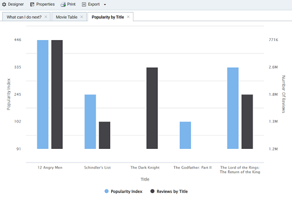
If you filtered the data in a previous step, the lens remains filtered on the chosen rating. You can de-select the rating in the filter or choose an alternate rating to explore the reviews versus popularity for additional titles.
For more information about working with Dashboards, see Access Data with Hi-Res Analytics Dashboards.