Getting Started: Exploring and Visualizing Data
When you start to build a new dashboard, you might not know what data exists in the knowledgebase, which values in that data you ultimately want to display, and the most pertinent way to visualize the results. This topic introduces the available lenses and filters and provides guidance on getting started by using the Anzo Hi-Res Analytics tools to perform data discovery. By experimenting with simple objects, you can explore the data, determine which questions you want to answer, and start to visualize the end result.
To get started:
Create a New Dashboard
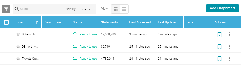
- In the Anzo application, expand the Blend menu and click Graphmarts. Anzo displays a list of the existing graphmarts. For example:
- On the Graphmarts screen, click the name of the graphmart for which you want to create a dashboard. Anzo displays the graphmart overview. For example:
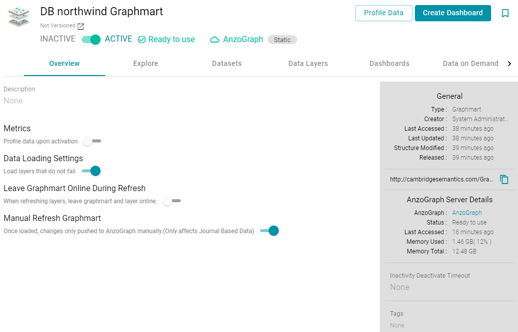
- Click the Create Dashboard button. The Hi-Res Analytics application opens and displays the New Dashboard dialog box.
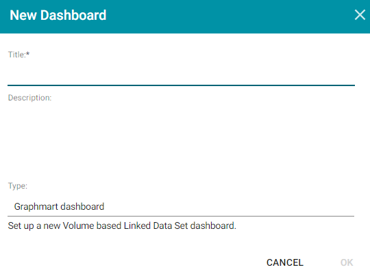
- Type a Title for the dashboard and enter an optional Description.
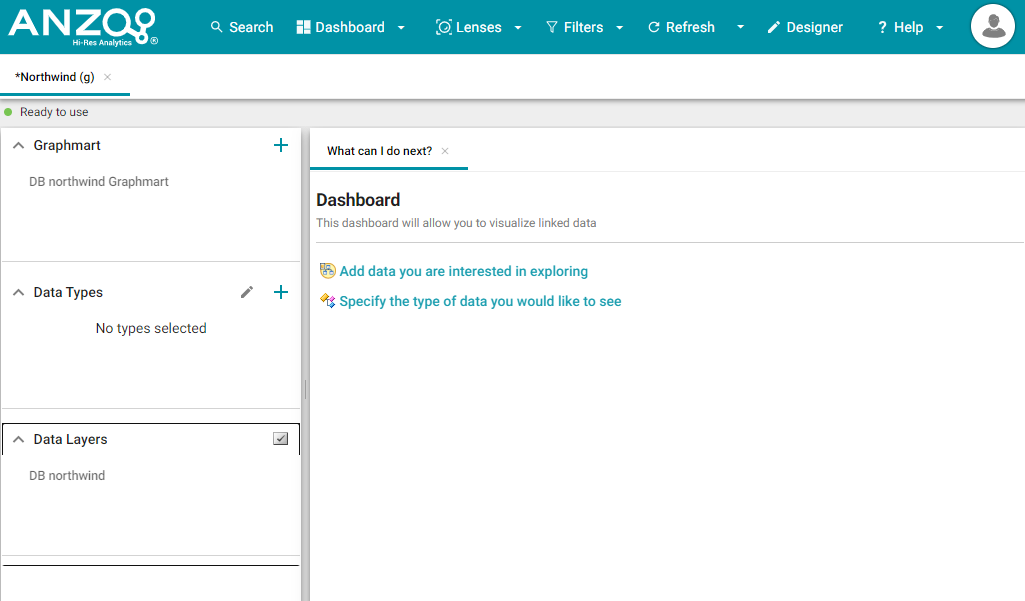
- Leave the default Graphmart dashboard value in the Type field and then click OK to create the dashboard. The new dashboard appears as a new tab on the screen and contains a sub-tab titled What can I do next?. This tab acts as a wizard to guide you through the initial dashboard creation. For example:
- In the main toolbar, click the Dashboard button and select Save. Proceed to Explore the Data below for guidance on next steps.
Explore the Data
Once you create a new dashboard, you can experiment with Hi-Res Analytics tools to get to know the data and decide the best way to display it.
Decide What Type (Class) of Data You Want to See
- First, review the types of data or classes that exist in the data set: on the What can I do next? tab, click Specify the types of data you would like to see. The Select Data Types dialog box displays the available data types. The value in parentheses shows the total number of instances of that type exist in the data set:
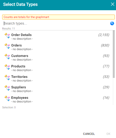
- Select one data type. The property that you choose determines the fields that become available to filter on.
Though you must choose one base data type for a dashboard, you can leverage the relationships in the graph to access and integrate data from additional classes. See Combining Data from Multiple Classes for more information.
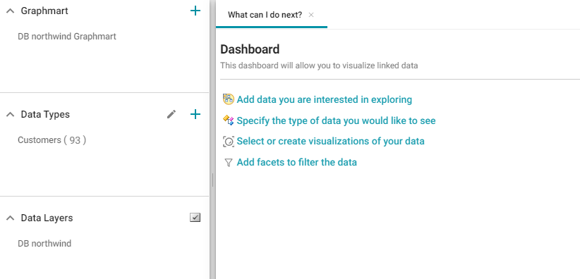
Click OK to close the Select Data Types dialog box. The data type is added to the Data Types panel on the left side of the dashboard and additional options becomes available on the What can I do next tab. For example:
Proceed to Create Filters to See the Values for Properties below for next steps.
You might want to create multiple dashboards so that you can click between dashboards and view multiple classes of data at the same time.
Create Filters to See the Values for Properties
To dive deeper into the data and quickly determine what values exist for the class of properties you selected, you can start adding filters to the dashboard. Filters reveal the values associated with fields and help you learn the data set specifics such as whether data exists for certain properties and whether the data includes many duplicate or unique values. Learning more about the details enables you to start making decisions about what properties to group on, for example, what properties have relationships, and what results you want to visualize on the dashboard.
- To create a filter, click Add facets to filter the data on the What can I do next tab. The Create Filter dialog box opens.
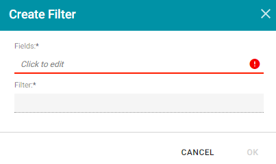
- In the Create Filter dialog box, click the Fields field and select the property or property path to filter on.
- Then click the Filter field to select the filter type. The list of available choices depends on the data type of the property you selected in Fields. The table below describes each filter type. For more information about the filters, see Filter Type Reference.
Filter Types
| Filter | Description |
|---|---|
Cloud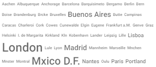 |
Cloud filters display values in term clouds where each term is written in a font size that represents the number of results for that value. Unlike list filters, which enable you to select and filter on multiple values at once, cloud filters allow you to filter on one value at a time. |
List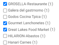 |
List filters display selections in a list and allow you to select and filter on multiple values at a time. The number in parentheses indicates the total number of results for that value. |
Single Select List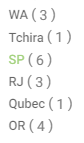 |
Single Select List filters are similar to List filters but, like Cloud filters, only allow you to select and filter on one value at a time. |
Limit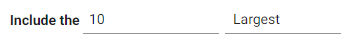 |
Limit filters enable you to limit the results to the specified number of largest or smallest values. You can use limit filters for any data type. For strings, results are ordered alphabetically. Largest orders by the last letters in the alphabet and Smallest orders by the first letters in the alphabet. |
Date Range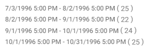 |
Date Range filters are available for date and time data types and enable you to define date ranges and group the results into those ranges. |
Numeric Range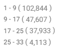 |
Numeric Range filters are similar to Date Range filters but are available for numeric data types and enable you to define numeric ranges and group the results into those ranges. You can select multiple numeric ranges to further filter the results. |
Range Slider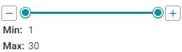 |
Range Slider filters display a slider control that enables you to filter results by a range that you specify by setting a minimum and maximum value. |
Relative Time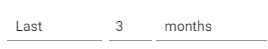 |
Relative Time filters enable you to search for records that fall into the specified time increment. You can filter on increments from years down to milliseconds. |
Search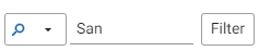 |
Search filters enable you to filter for records that contain a partial match, exact match, or do not equal the value that you specify. |
Presence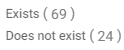 |
Presence filters indicate whether a specified value exists. This filter is useful for finding records that exclude a particular value. Presence filters are available for relative paths and properties of all data types. |
Quartile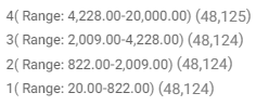 |
Quartile filters group and rank the values for a property into four equal ranges. |
| Hierarchy | Hierarchy filters enable you to view parent and child relationships and filter data based on those relationships. Hierarchy filters are only available for relative paths, indicated by a path icon ( |
Types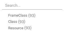 |
Types filters enable you to filter on each type of child property that is related to the specified parent property. Types filters are only available for relative paths, indicated by a path icon ( |
Create Visualizations of the Data
Once you have a good understanding of the values and relationships that exist in the data set, you can experiment with the Hi-Res Analytics lenses and decide on the most appropriate way to display the data. Creating a Table lens is a quick way to view the data that you filtered. This section provides instructions for creating a table lens and describes each of the lenses available in Hi-Res Analytics.
- To create a table lens, click Select or create visualizations of your data in the What can I do next tab. Anzo displays the Lens Selection dialog box.
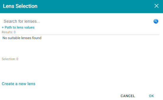
- In the dialog box, click Create a new lens. Anzo displays the Create Lens dialog box.
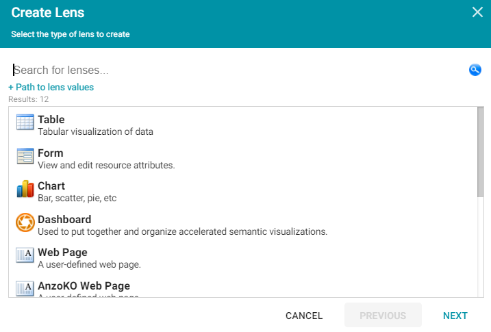
- Select the Table lens and click Next.
- Type a Title for the lens, and then click Finish. Anzo opens the Table Designer:
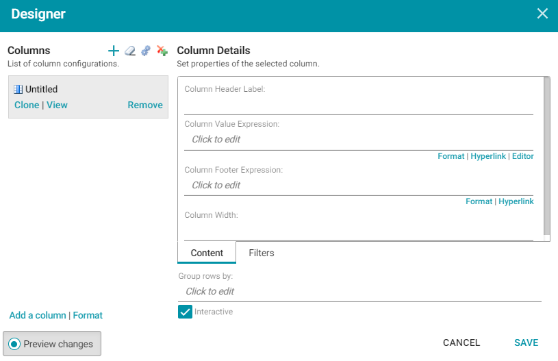
- In the Designer, click the Auto-generate columns icon (
 ) to add all available columns to the table. Then click Save.
The new lens displays as a new sub-tab on the dashboard and displays the data according to the data type and filter or filters that you created. Now that you can view a summary of the data in a table, it can help you determine how to further narrow or expand the results by adding, changing, or removing filters. In addition, you can experiment by adding other lenses to the dashboard to find the ideal way to display the data to answer the questions that you have. The table below describes each type of lens. For more information about each lens, see Lens Type Reference.
| Lens | Description |
|---|---|
| AnzoKO Web Page | AnzoKO Web Page lenses include the Knockout JavaScript framework and enable you to display data on a web page that you create using HTML, CSS, and JavaScript. |
Chart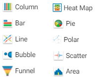 |
Anzo offers several types of Chart lenses. These lenses are useful for displaying large amounts of complex data and have the widest format range of any lens type. The ability to add an axis enables you to compare data, such as for comparing monthly sales data for multiple stores. |
Dashboard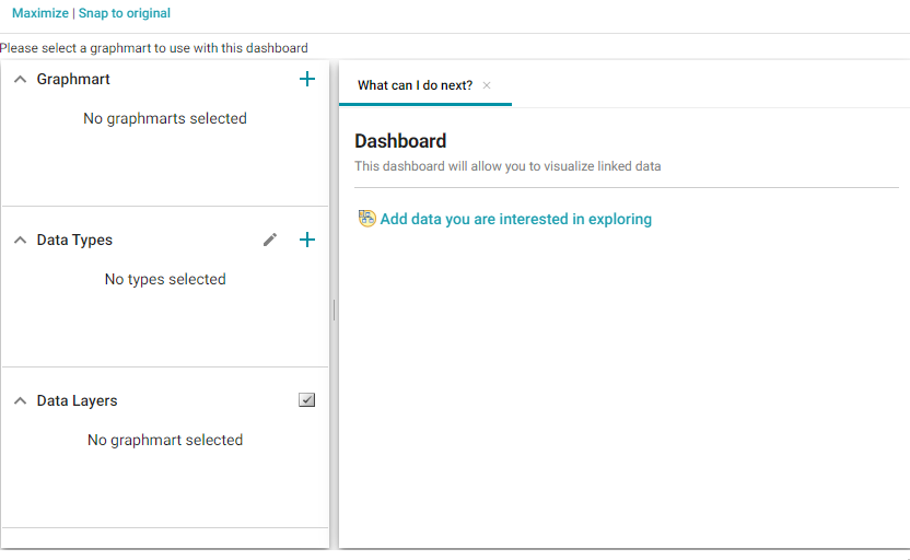 |
Dashboard lenses display a dashboard within a dashboard. |
Drill Down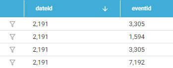 |
Drill Down lenses create clickable data points that enable you to drill down to view additional details. You can specify mutliple lenses within the Drill Down lens so that clicking a data point presents the data in a different view. |
Form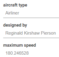 |
Form lenses enable you to create an editable or read-only form on the dashboard. Creating forms can be useful for displaying many details about each record instead of using a table where the large number of columns makes the data hard to read. Form lenses are valid in Linked Data Set Dashboards. In Graphmart Dashboards, form lenses do not display instance data. |
List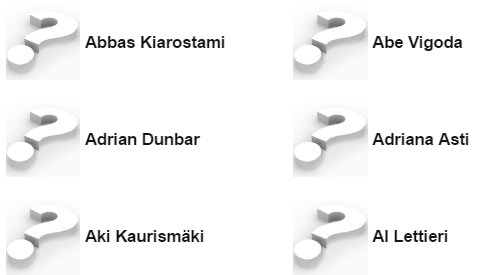 |
List lenses display results in a list layout, similar to the Microsoft Windows® Explorer interface. The lens enables you to add icons for each data value, and results are grouped onto pages according to the Page Size value that you specify. |
| Network Navigator | Network Navigator lenses provide interactive graph visualizations for viewing and exploring relationships across your entire network of data. The lens enables you to quickly generate a standard graph or hierarchical view of the data and then customize the visualization to target the relationships and information that interests you. |
| Query | Query lenses enable you to retrieve data using a custom SPARQL query and display the results by writing basic HTML and CSS. You can use a Query lens to access data from external sources. Query lenses do not bind directly to the linked data set, data type, or filters defined on the dashboard. |
Resource Tree Navigator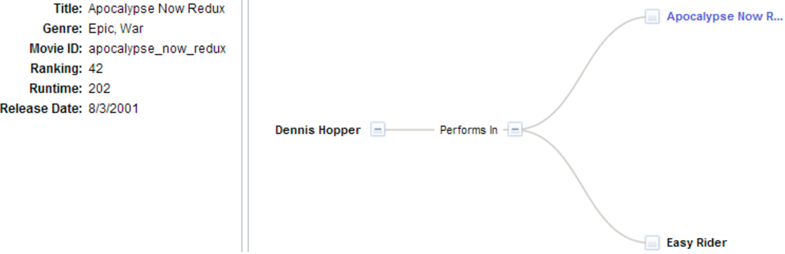 |
Resource Tree Navigator lenses display results in a hierarchical tree view. You can click parent data points to open the successive child data points. This lens is useful for presenting small amounts of data; each discrete group appears on a separate page in the dashboard. You can also click certain objects to view the object's data properties in the left panel. |
Table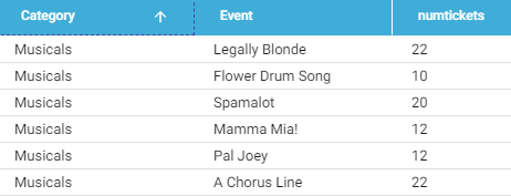 |
Table lenses present results in a basic table grid consisting of rows and columns. Table lenses are useful for presenting data aggregates or summaries. |
| Web Page | Web Page lenses enable you to display results on a web page that you create using HTML, CSS, and JavaScript. |